Positionierung von Kacheln
Guten Tag,
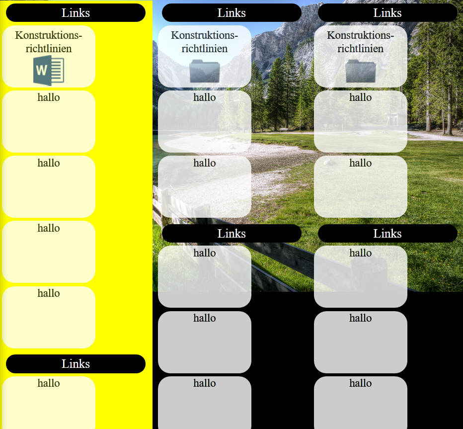
ich brauch eure Hilfe. Ich hab ein Problem das ich einfach nicht hinbekomme. Ich habe 3 Spalten die gleich aufgebaut sind mit Kacheln ausgestattet, die als Bedienfeld dienen sollen.
Ich möchte die Kacheln in den Spalten die immer nach Links fließen mittig anordnen. So wie die Überschriften über den Kacheln ("Links"). Also wenn das Fenster gezogen wird: 1 Kachel wird mittig positioniert und sobald genügend Platz vorhanden ist für 2 Kacheln sollen die sich nebeneinander mittig zentrieren. Ich hoffe, ihr könnt mir helfen =).
Kommentar abgeben zu diesen Beitrag/Code ? Dann hier klicken
Der hier verwendete Code
<html>
<head>
<meta http-equiv="Content-Type" content="text/html; charset=utf-8" />
<title>Intranet</title>
<style>
@charset "utf-8";
/* CSS Document */
body
{
width:100%;
height:100%;
z-index:-1;
margin:0px;
padding:0px;
background-image:url(/image/Hauptbild-mit-Rand.jpg);
background-size:100%;
background-repeat:no-repeat;
background-color:black;
}
.allgemein
{
width:100%;
height:50px;
text-align:center;
color:white;
font-size:30px;
}
.logo
{
position:absolute;
right:50px;
top:0px;
width:50px;
height:50px;
background-image:url(/image/Hauptbild-mit-Rand.jpg);
}
.exe
{
position:absolute;
right:0px;
top:0px;
width:50px;
height:50px;
background-image:url(/image/Hauptbild-mit-Rand.jpg);
}
#main
{
width:100%;
height:100%;
margin-top:0px;
}
.box1
{
width:33%;
height:100%;
margin-top:0px;
float:left;
min-width:160px;
background-color:yellow;
}
.box2
{
width:33%;
height:100%;
margin-top:0px;
float:left;
min-width:160px;
}
.box3
{
width:33%;
height:100%;
margin-top:0px;
float:left;
min-width:160px;
}
.abstand
{
width:0.5%;
height:100%;
margin-top:0px;
float:left;
}
.header1
{
width:30%;
height:30px;
background-color:black;
position:absolute;
text-align:center;
margin-left:1.5%;
border-radius:15px;
margin-top:5px;
font-size:20px;
color:white;
}
.area
{
position:relative;
width:100%;
margin-top:40px;
min-height:100px;
height:auto;
overflow:auto;
text-align:center;
}
@media only screen and (min-width:701px) and (max-width:1800px) {
i{
display:flex;
}
.button
{
width:150px;
height:100px;
background-color:white;
margin-left:auto;
margin-right:auto;
margin-bottom:5px;
border-radius:20px;
text-align:center;
font-size:18px;
opacity:0.8;
}
}
@media only screen and (min-width:1px) and (max-width:299px) {
div{
display:none;
}
#test
{
text-align:center;
display:block;
color:red;
width:100vw;
height:100vh;
font-size:20px;
}
}
@media only screen and (min-width:300px) and (max-width:700px) {
.button
{
width:150px;
height:100px;
background-color:white;
margin-left:auto;
margin-right:auto;
margin-bottom:5px;
border-radius:20px;
text-align:center;
font-size:18px;
opacity:0.8;
}
}
.header2
{
color:black;
margin-top:5px;
}
.datei-ordner
{
width:50px;
height:50px;
background-image:url(/image/Hauptbild-mit-Rand.jpg);
margin:auto;
}
.datei-word
{
width:50px;
height:50px;
background-image:url(/image/Hauptbild-mit-Rand.jpg);
margin:auto;
}
.datei-excel
{
width:50px;
height:50px;
background-image:url(/image/Hauptbild-mit-Rand.jpg);
margin:auto;
}
.datei-pdf
{
width:50px;
height:50px;
background-image:url(/image/Hauptbild-mit-Rand.jpg);
margin:auto;
}
.datei-sw
{
width:50px;
height:50px;
background-image:url(/image/Hauptbild-mit-Rand.jpg);
margin:auto;
}
</style>
</head>
<body>
<div class="allgemein">Intranet<a href="Intranet.html"><div class="logo"></div></a><a href="Intranet.html"><div class="exe"></div></a></div>
<div id="main">
<div class="box1"><p class="header1">Links</p><div class="area"><div class="button"><div class="header2">Konstruktions-
richtlinien</div><div class="datei-word"></div></div><i><div class="button">hallo</div><div class="button">hallo</div></i><i><div class="button">hallo</div><div class="button">hallo</div></i></div><p class="header1">Links</p><div class="area"><i><div class="button">hallo</div><div class="button">hallo</div></i><i><div class="button">hallo</div></i></div></div>
<div class="abstand"> </div>
<div class="box2"><p class="header1">Links</p><div class="area"><div class="button"><div class="header2">Konstruktions-
richtlinien</div><div class="datei-ordner"></div></div><i><div class="button">hallo</div><div class="button">hallo</div></i></div><p class="header1">Links</p><div class="area"><i><div class="button">hallo</div><div class="button">hallo</div></i><i><div class="button">hallo</div></i></div></div>
<div class="abstand"> </div>
<div class="box3"><p class="header1">Links</p><div class="area"><div class="button"><div class="header2">Konstruktions-
richtlinien</div><div class="datei-ordner"></div></div><i><div class="button">hallo</div><div class="button">hallo</div></i></div><p class="header1">Links</p><div class="area"><i><div class="button">hallo</div><div class="button">hallo</div></i><i><div class="button">hallo</div></i></div></div>
</div>
<p id="test">
Ab hier fangen Handy grössen an und brauchen an besten andere Einstellungen.Mfg basti1012
</p>
</body>